Philadelphia in a Booklet
2024
BRANDING
SPREAD LAYOUTS
PRINTING
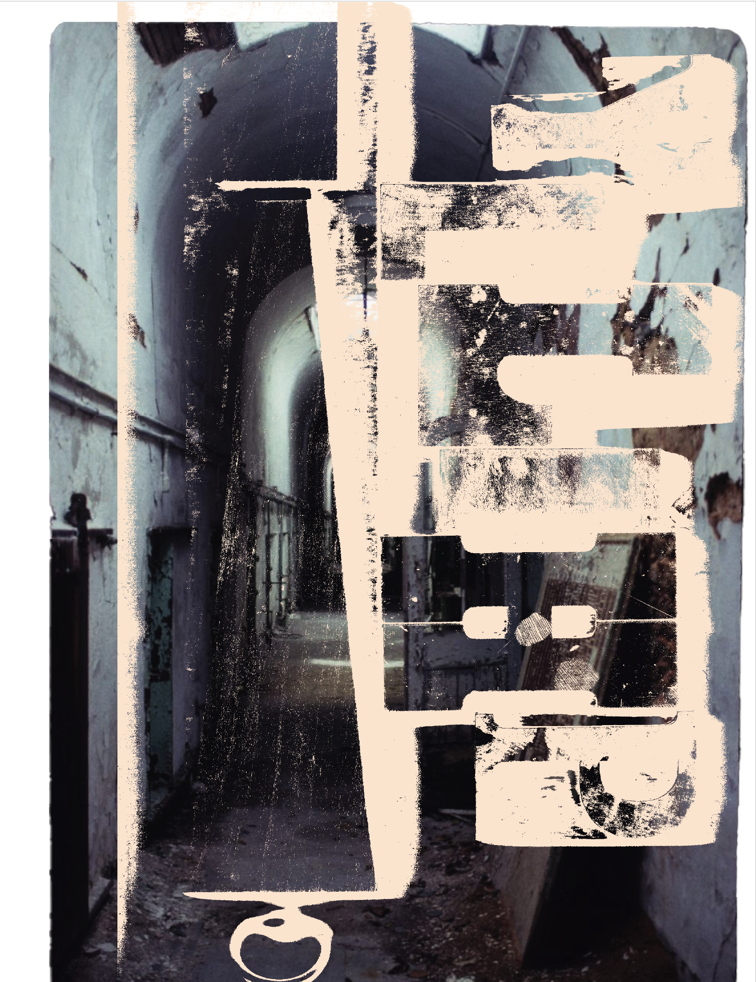
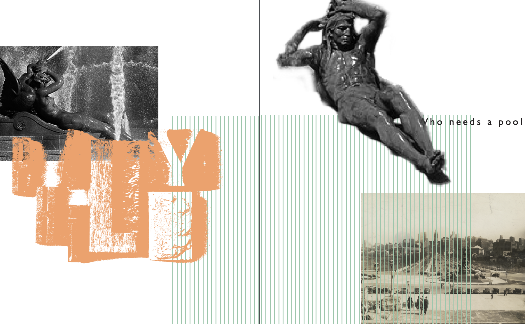
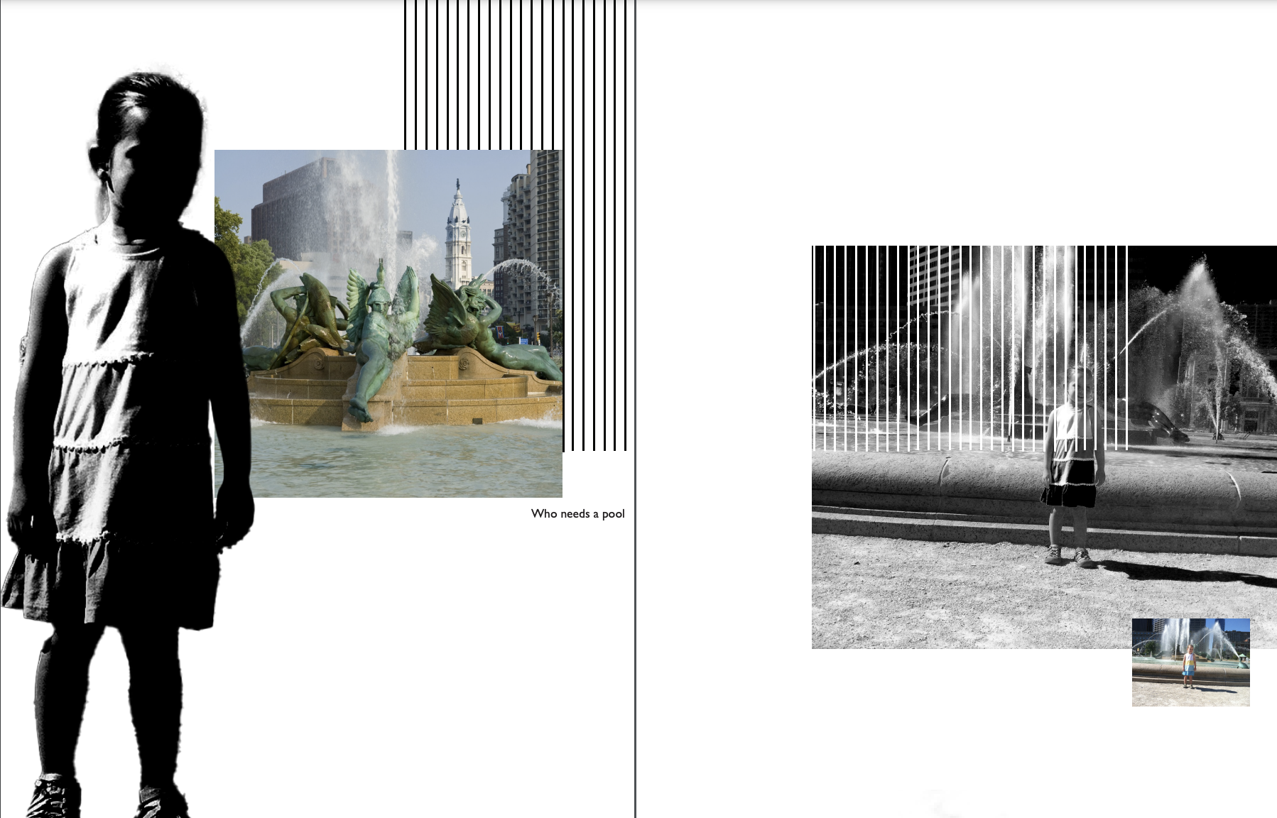
The result of this exploration was a booklet, comprised of spreads with various combinations of the printing press letters, historical images, and personal images. I worked with a partner who did a parallel exploration for New York City, which was also incorporated into the booklet.
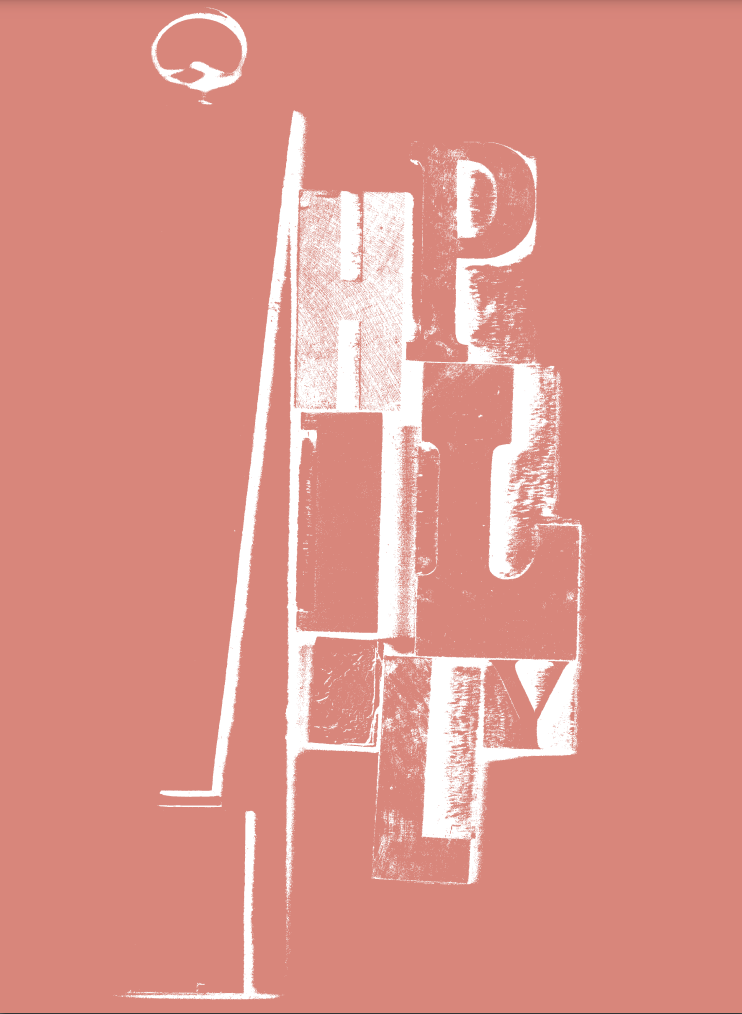
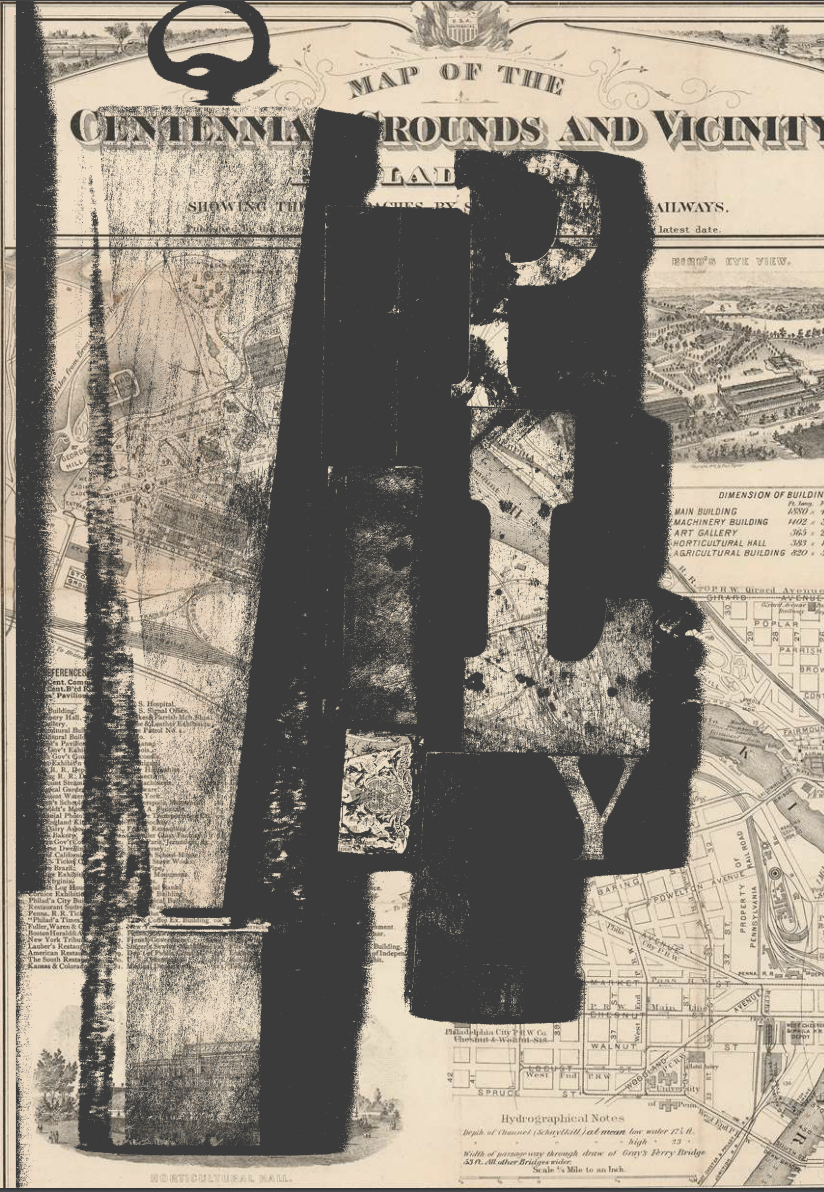
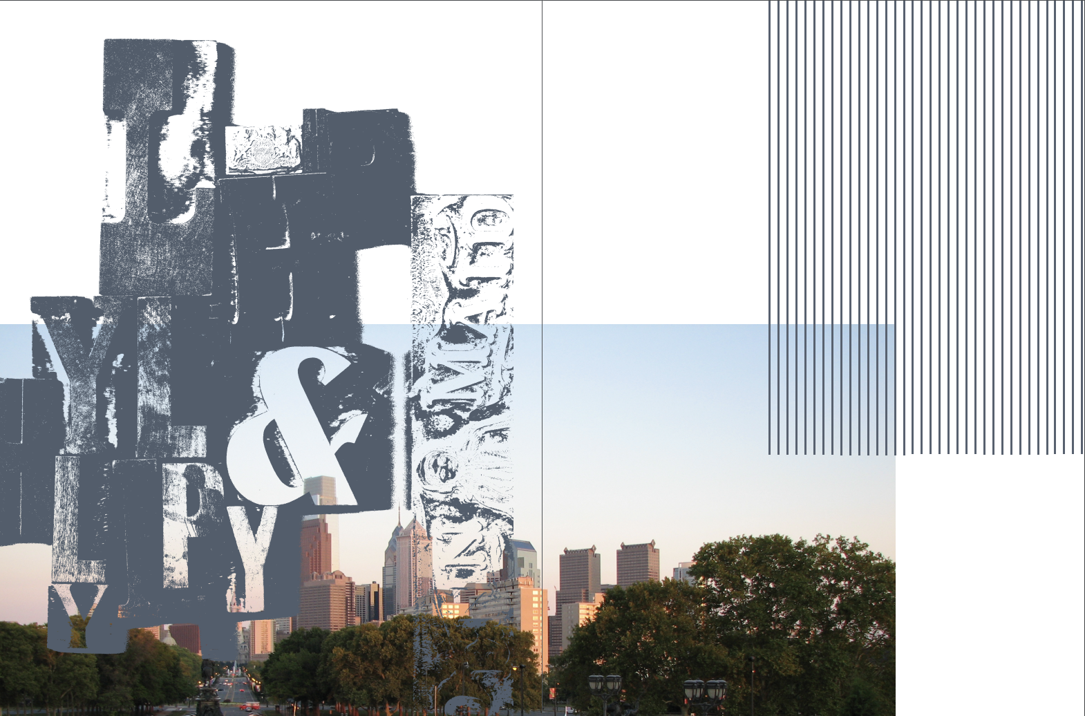
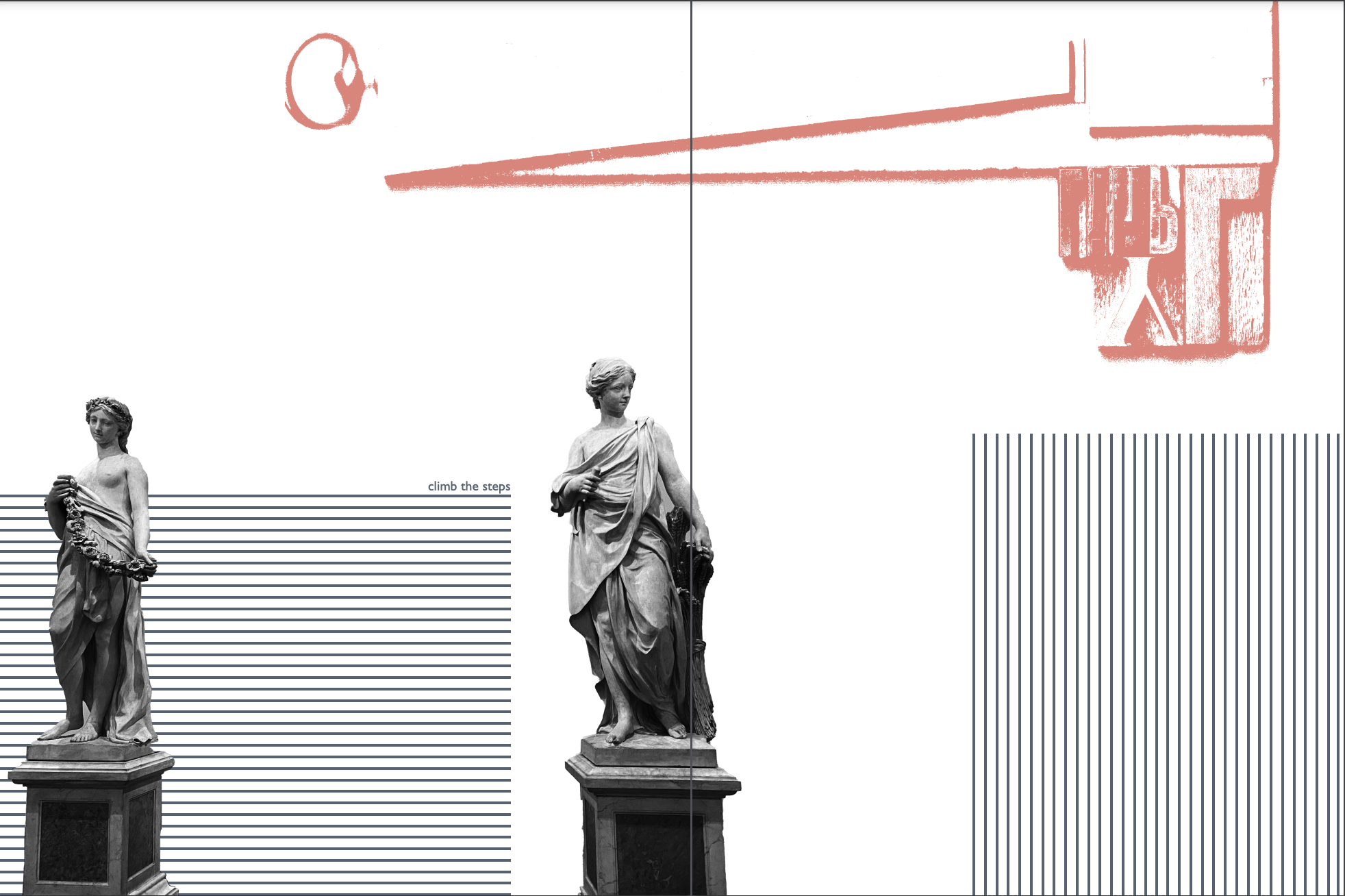
As part of a project exploring how to communicate broad topics, such as “time,” I found printing press letters and used their texture to create a specific typeface for Philadelphia. The idea was that time is viewed primarily as the juxtaposition of the old and new. The ‘old’ and ‘new’ that I juxtaposed were the historical image of Philadelphia versus my own, more recent, experiences with the city.
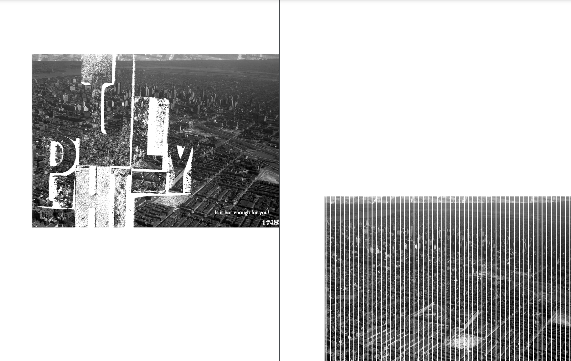
I used scans of printing press letters overlaid on a view of the Philadelphia skyline from the twentieth century. The tagline “is it hot enough for you” is used throughout, chosen from an ironic comment from Philadelphians in the height of summer weather. The end product for this specific design is a postcard, and in the booklet the printing press typeface introduced here is used throughout.